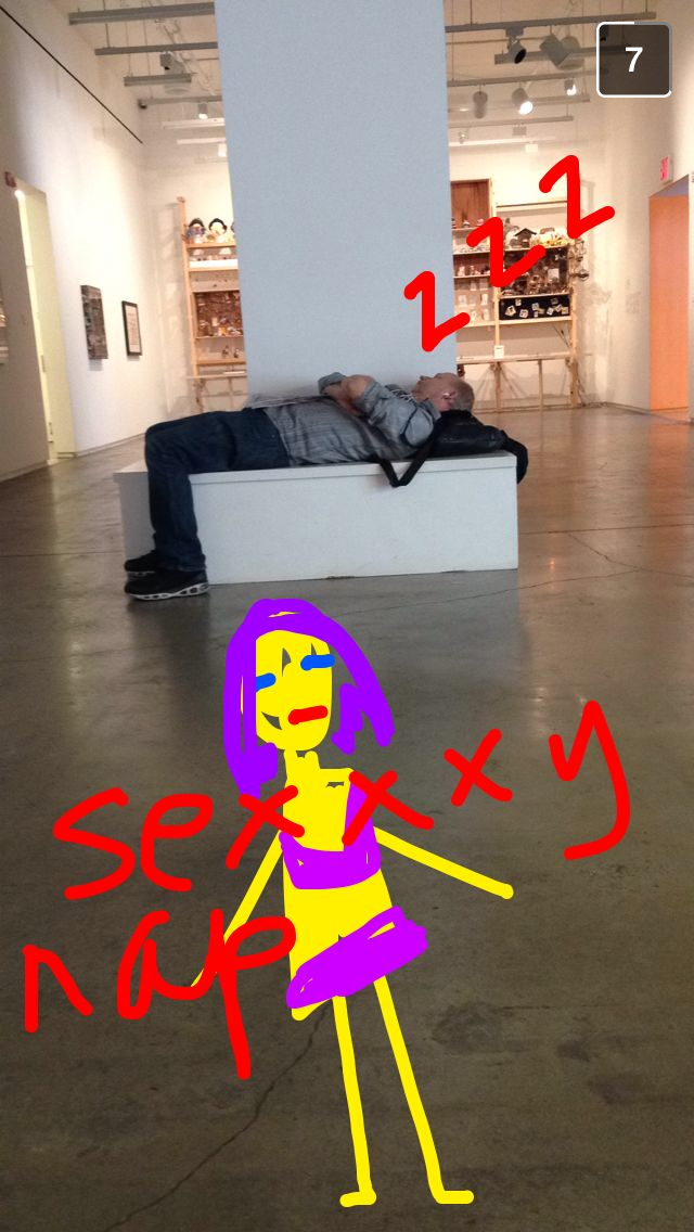
visual art

interview, visual art

Continuity with Emily Tat

Continuity I, 2017

Continuity I, 2017

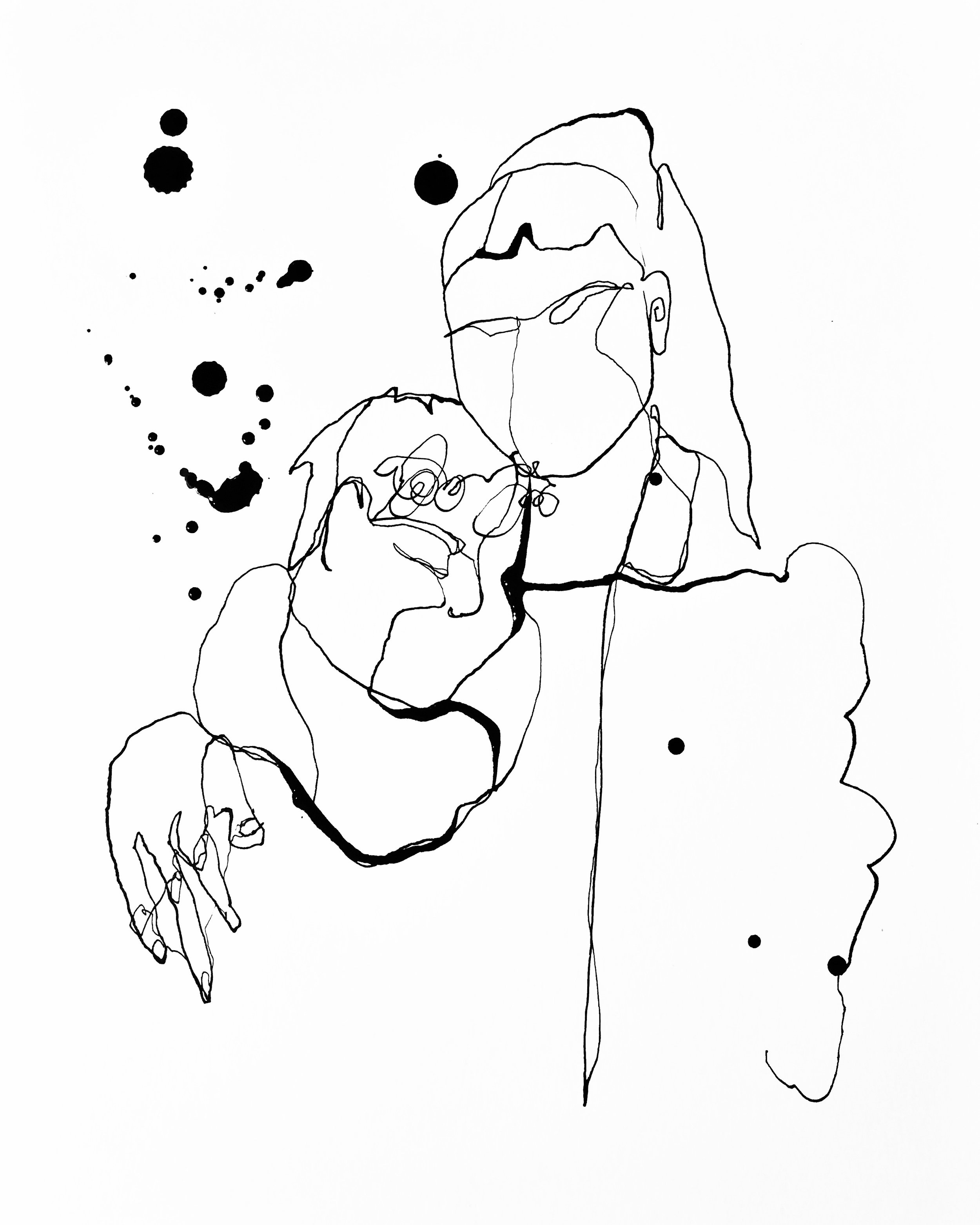
Artist and illustrator Emily Tat moved to New York with her partner this past fall. Her style incorporates ink drawing and watercolor, sometimes tracing her figures in water and allowing the ink to seep into the damp paper. Ralph Steadman is an easy comparison, and one that she invites. “It’s such a compliment because he is fucking amazing. He uses protractors to make these very straight lines and protractors to draw the eyes. But all around the figures is just ink everywhere.”

Her current style is a recent development in her artistic career. “I used to do photorealistic oil paintings. When I was doing my degree in my final painting course, I had a very specific style, and I felt that I had to stick to it. I got criticized very badly by the professors. So I decided to go another way and began making video art, but I never felt quite into what I was doing. Shortly after I started dating my partner, Guido, we were in his dorm room, he was playing music and I felt like drawing. He only had this calligraphy pen that I still use. It forced me to draw loosely in a way that I never had to before. My favorite thing about drawing this way is that I feel that I can be very abstract and mess around with overlapping colors and spilling ink. I also like it to be very clean, with lots of negative space around what I’m drawing. I never sketch things out, so sometimes I run into the edge of pages.”

Guido, 2015

Guido, 2015

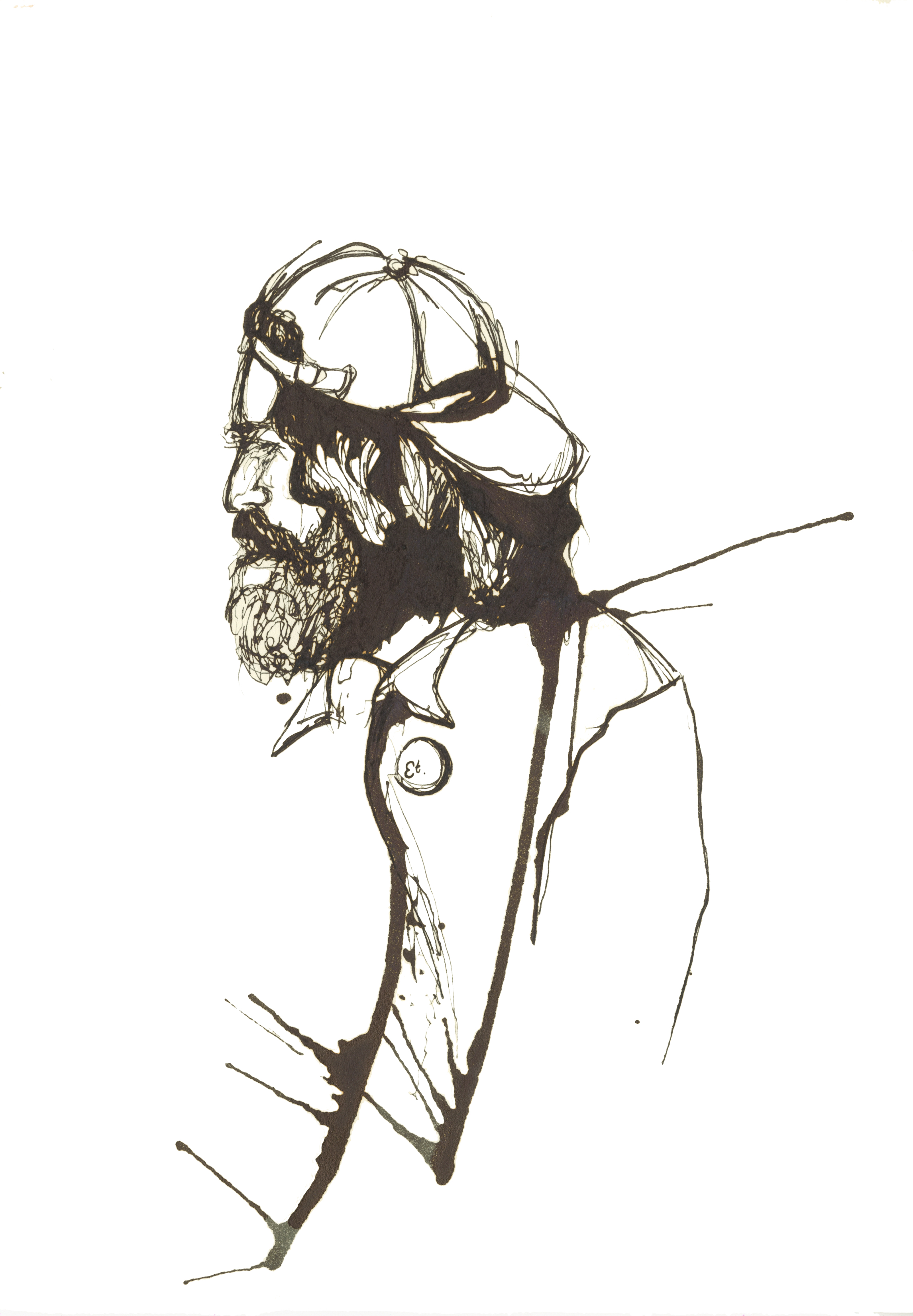
Portraiture is an incredibly important aspect of Emily’s oeuvre, and she strives to capture her sitter’s essence while keeping the form minimal and legible. “I think it’s important to get the form of something, and to keep its structure. At the same time I like to add these weird, abstract elements to it. I do it a lot with feet and hands, and to exaggerate limbs and fingers. It’s important to capture the structure of someone’s face. I was doing a commission for this couple, and they said they really felt that I captured both of them and their connection to each other. That is the depth that is important for me to capture in a drawing… What I’m driving for is for them to see the portrait and say ‘that’s me!’ I get frustrated with myself very quickly. If I feel that I haven’t captured someone it, then it really upsets me.”

Galentines Day, 2018

Galentines Day, 2018

What captivates Emily most when portraying subjects are sharp and angular features, but capturing these characteristics is not her main goal. The ritual and process of portraiture is what attracts her to that type of work. “When I first started doing this kind of work, a lot of people asked to pose for me. It’s just really nice when someone wants that moment. If you think about it, unless you’re in a relationship with someone how often do you get to look at someone’s face? You forget things like what color someone’s eyes are or the shape of their nose. You only get to know that when you look at someone’s face over time. So it’s really nice to have that 3 or 4-hour period where I can take a friend, or someone I don’t even know at all, and really look at them. It can make someone very vulnerable if they are posing naked. People often do it when they want a bit of validation or a little moment for themselves. I think people often don’t get enough attention, and so it’s really nice to have the opportunity to give people that recognition.”

“Since I’ve moved here I’ve had some ups and downs, but I feel as if I am having resurgence” Emily said. She started making single-line drawings, creating still lifes and portraits without lifting her pen from the paper. “I really love it because everything that is in my head can just spill out onto the page. It’s very reflective of the medium that I use as well, because ink is very quick and you have to make decisions immediately.” Her subjects have also become more personal since starting these single-line drawings. Emily showed me a drawing of her and her friend Julia and a drawing of a jar of nutmeg. “[Julia] is just one of my most special friends in the whole entire world. Ever since we met, we have had this incredible friendship that’s never faltered. I don’t have that many friendships like that. Doing a portrait in this way is really reflective of how I feel about her. I enjoyed making single-line drawings of things that comforted me, since I had just moved here. Even though things are different and weird in this country, these drawings remind me of the things in my life that are continuous. It goes beyond relationships between me and other people. There are ones of certain foods that are special to me, because my homesickness manifests itself often through food. Guido and I have this jar of whole nutmeg in our kitchen. Back in London he kept banging on about how he wanted whole nutmeg in the kitchen and he couldn’t find it anywhere, so I found some for him we I went to the south of France. It’s this continuity from our kitchen in London to our kitchen here that mirrors the continuity of our relationship.”

Nutmeg, 2017

Nutmeg, 2017


You can see more work by Emily Tat on her website.

interview, visual art

New York on a Canvas: Art by David Bransfield

New York City is not a place. It’s an experience. The buildings are high, apartments small, and streets overpopulated – but it never feels claustrophobic. Artists have tried to replicate its paradoxical beauty for as long as both the city and art have existed. And although the New York experience can’t be framed, artist David Bransfield has managed to bring his experiences of New York to life.

This interview has been edited and condensed.

Natalia Lehaf: How do you describe yourself as an artist?

David Bransfield: This is a totalizing question that is never easy for an artist to answer, especially because at this point in time I seem to be interested in many contrasting ideas and mediums. Overall, I would say that the common thread of my interests is the experiences and memories involved in the creation and immersion of a space. My previous work has spanned from ideas about geometry to urban landscapes to extremely conceptual depictions of surreal spaces, and I think that all of these ideas have a very specific relationship to the individual viewer.

NL: What’s your background in art, both academically and personally?

DB: I have always been extremely curious as to how things are made, both from an artistic and architectural standpoint. My interests in both art and architecture turned into a career choice around 9th grade. I began attending an after-school art program on Long Island called the Huntington School of Fine Arts, where for the first time I was trained in the classical mediums of drawing, painting, and sculpting. I spent a couple years there and grew exponentially as an artist, and then from there I attended NYU as a double major in Studio Art and Urban Design & Architectural Studies.

NL: Your sketches and paintings of New York City are very lifelike and precise. What is your relationship with the city?

DB: I grew up on the Queens/Long Island border only 20 minutes from Manhattan, so New York is my home. New York has always had an intense influence on how I think about art and architecture. Coming from such a rich and diverse place, I have always been interested in the makeup of communities as an insular composition of like-minded people, especially in New York where there are still many ethnic and religious-based communities. What interests me is how each of these communities come together to form a larger area that many people consider the “melting pot” that is NYC, yet there is still a definite division between neighborhoods, each with their own character and influence on each other. It is the dissection of “micro” versus “macro” in terms of the individual and the community that I have been trying to dissect in my more recent work. I am also extremely interested in this in terms of architecture and urban planning as well.

NL: What’s your process like?

DB: I’ll talk about the process for my most recent series of paintings, which were 6 to 10-foot urban landscape oil paintings. I began by assigning myself a large urban area to explore, which in this case was Chinatown. Then I wander. I find that wandering instead of trying to seek specific spaces can sometimes be more rewarding. If you have too specific of a goal, you will lose all sense of exploration in an attempt to find this goal and you may miss many unexpected opportunities. I had a set of guidelines to follow (finding spaces with rich color palettes, graffiti, and interesting people) but I let myself explore within these guidelines. For my first several wanderings I simply walk around and document spaces. I then go through my photographs and choose spaces which I believe have the most rewarding compositions and environments, and revisit these sites several more times for extended periods to capture a specific scene I wish to convey in my painting. After I decide on a composition which I believe makes for the best painting (this could be a single photograph or an agglomeration of several), I then make a series of sketches to resolve any compositional issues. This entire process generally lasts about 2 to 3 weeks before I begin the actual painting. The paintings themselves usually take about the same amount of time, and I try to stick with just one to two paintings at a time so I can focus on them without too many other distractions. I find that, personally, if I do not complete a piece within a reasonable amount of time or if I stop and revisit the piece later then it often turns out fragmented. Other than that, I do not focus too much on setting rules for myself while painting. I often find that the painting itself will dictate the rules of its creation, and I do not set these rules until I have already started painting. Stylistic rules will sort themselves out as the piece is being created. In terms of completion, I never feel like my paintings are truly finished. It is really just a matter of reaching a point where I am comfortable stopping, which I know is coming when I begin to get sick of the painting!

NL: You’re out of the city and studying architecture at Yale now. Are you continuing to paint and draw?

DB: I am still practicing art here, but I guess it depends on your definition of art. I am doing a lot of drawing (not as much painting because it is not as relative to the practice of architecture) but the drawings I am doing now serve more of a utilitarian purpose in that they are meant to convey the essence of my architectural projects. I would definitely argue that this is still an artistic form because there are infinite possibilities about how you convey your project, which will ultimately determine how the architecture is perceived. In this way it is almost just as important to have a strong representation of your building than to have a strong building itself. I am also learning to become extremely proficient with computer programs and to bring together multiple mediums in a single drawing which is exciting. I hope that after my time in architecture school I will be able to mix my skills and concepts learned from both art and architecture and find a truly intriguing and original artistic path for myself.


For more of David's work, check out his website.

visual art

A bit of everything: the collages of Ian Farrell

Introduction by Natalia Lehaf

Ian Farrell makes things. Music. Pictures. Collages. I’ve known him since my freshman year at NYU, as he was just beginning to decide what he wanted to study. Over the years, I watched him develop his personal artistry and, in doing so, add beauty and ideas to the world. Like any strong piece of artwork, Ian’s creations make you think. They stop you in your newsfeed scrolls and force you to look, stare, and ponder. I find the effect to be as impressive as the piece itself.

In particular, I love immersing myself in his collages. Some background information on Ian’s collages:

  • He started making collages in a class based on fairy tales led by a professor who often explored mixed media.
  • He finds inspiration in his mother’s house. She’s big on antiquing, and her house has always been full of old things.
  • Much of his work grapples with the female form and “The potential mysticism that can surround it.”

My recommendation to the TCBP audience: As you look at his collages, be sure to note his use of dimensions, new or foreign places, and colors.


Ian Farrell is a collage maker and photographer with a degree in photography from NYU. He current lives in Orange County, California. Find more of Ian's work on his website.

visual art, interview

Néha Hirve: the visual artist behind the Winter 2016 cover photo

Néha Hirve is a graduate of the NYU Tisch School of the Arts. When she created this issue's cover photo, she was a year out of NYU and getting a Masters in Photojournalism in Sundsvall, a small town in the north of Sweden, at Mittuniversitetet. She’d wake up, eat knäckerbröd with Kalles Kaviar for breakfast, go to class until five, sometimes grab a beer, and then go home. There, she did some reading to get inspired, and then as the sun set, she would head to the school’s media lab to use the tablet for her graphic designs. As she was usually the only person in the building at that hour, she would play music as loud as she wanted, having an illustration party until one or two in the morning. Néha sacrificed hours of sleep for her craft. She took every ounce of energy — an energy that for most people is nonexistent at the end of the day — and poured it into creating a vision. And given the final result, the sacrifice and labor seemed well worth it.


This interview has been edited and condensed.

Natalia Lehaf: You have a background in film at NYU. Did your studies impact your graphic design work at all?

Néha Hirve: I think that being a cinematographer at NYU taught me to see light and colour. My graphic design work heavily involves light and colour, most of my illustrations are set in the night time where the light makes itself present in strange ways. I think I always had the scenes inside me, but NYU gave me the tools to express them. I see things more cinematically since NYU. I also think more about narrative in my work.

NL: Do you have any pieces you can pinpoint as examples of that?

NH: Well, the piece with the bear (“It's hard to reach out to you...”) is an example of that. I recently moved to the North of Sweden and I took a camping trip with some Finns in the Höga Kusten (high coast) and that's what inspired that piece. Spending the night under those trees, such tall trees, I could really feel a presence in the history of that area. My work doesn’t necessarily have a fixed narrative or "plot" in terms of a beginning, middle, or end, as a film would, per se. But they're definitely a moment in a larger personal narrative. I like to leave it to the viewer to construct that larger narrative for themselves. My titles are sort of alluding to a larger story, too; they add another layer to the scene.

via nehahirve.com

NL: I wanted to ask about your tag lines for each image, actually. Where does the inspiration stem from? Is it the same place as the inspiration for the image?

NH: They're maybe snippets of a conversation I overheard once or a song or sometimes the warped memory of a song I’ve heard long ago. I always come up with the titles after the image, and usually they just fit with the overall feeling and atmosphere of a piece. For the most recent piece, it was sort of a joke — I'd been listening to a song by the Tallest Man on Earth on repeat for the entire process (which had something similar to that line in it), which took about 30 hours, and felt like a thousand years.

NL: Do all designs usually take that long?

NH: They're taking longer and longer. I am an impatient person, so my initial work I'd rush to finish; they'd take a few hours at most. Then once I started settling into my style, which is very detailed line work and hatching, I learned to get into a sort of trance state and really enjoy the labor of it. Once I discovered I could do it all in Photoshop, my canvas size became unlimited. So yeah, they're pretty tedious to do!

NL: Oh dang.

NH: Yeah, you need to be a bit obsessive to do this, I think.

via nehahirve.com

NL: Are you able to work on other projects while in the middle of a design, or do you only focus on one project at a time?

NH: I'm also a photojournalism student, so there are a lot of creative projects vying for my attention, so I focus on just one illustration at a time. I have a long list of ideas and images, but once I get into a project, I can't work on another until I finish it.

NL: I know that you are getting a Masters in Photojournalism in Sweden. Where are you pursuing your degree? How long is the program?

NH:I was born in India. I grew up in India, in the USA and in Switzerland. I only moved to Sweden a few months ago. The program is two years long.

NL: And are there certain stories you wish to tell via photography rather than film or graphic design?

NH: I'm inspired by my dreams, my memories, and the things around me. Right now, the woods and the sky are heavily featured in my work. The trees here are different, the light is different. Being so close to the Arctic Circle really changes the quality of the twilights. And after five years in New York City, I'm finally seeing the stars again.

via nehahirve.com

NL: That must be nice. What is your favorite medium to work in?

NH: I love working with ink and paper. I love the physical mark that it makes, and I come from a long background of scientific diagram-drawing, which I find very relaxing. There are disadvantages to that though, so I recently switched over to an all-digital workflow - a Wacom tablet and Photoshop. It's a steep learning curve, but it allows you to correct your mistakes non-destructively!

NL: Is there any story you are trying to tell with your work? Any message?

NH: Although most of the pieces are a bit surreal and unsettling, I want to evoke a feeling of a very distant memory or dream. Although the exact memory itself isn't defined or necessarily describable in any words, we all wake up from dreams whose emotions and colors are vivid and real. Even though they can be unsettling, we re-remember them over and over to get a 'hit' of those emotions and colors. I want to create this sense in the viewer. In a nutshell I would call my stuff "memories of dreams." I had all these dreams when I was a kid, of being outside, of being under the moonlight and looking in on lit up windows and longing for that comfort and warmth.

via nehahirve.com

NL: I know you are in Hungary right now. Has this experience affected any of your work thus far?

NH: I actually just got back to Sweden. I was on the Hungarian-Austrian border photographing and documenting refugees. I think that this experienced definitely changed me. We met thousands and thousands of refugees being funneled through the border, paradoxically made invisible. I'm working on a photo-essay about that experience, but I think it will also inspire my illustration. There were trains that would pull up in the dead of night, and literally two thousand people would climb out in silence.

NL: Wow. That's intense. I'm excited to see what these graphic experiences inspire in your upcoming work.


Néha is a photographer and visual artist based in Northern Sweden. Her work is based on memories of dreams she may or may not have had at some point in her life. You can find more of her work on her Instagram or website.

photography, visual art

Small Objects Create Big Worlds: a tour of Jennifer Wells' miniature diorama photography

Introduction by Natalia Lehaf

When I first saw Jennifer’s art, I was immediately captivated. I haven’t seen an artist evoke raw human emotions with tiny objects – things – like this ever before. Her work is endlessly beautiful and unique, and her ability to create new worlds in her miniature diorama photography is eerily inviting. The fragments of Jennifer’s work are composed with tactful and resourceful planning, as she prioritizes the time and thought going into her work from the very conception. Once she has an idea, she begins to hand-make accessories or meticulously select the exact item to complete her vision. These concepts laid out on a 1:12 scale speak the stories of her thoughts and experiences. Jennifer is a true storyteller, mirroring the intimate details of her life onto the figures in her projects. It takes courage to reflect, confront, and defeat one’s secrets and fears; it takes heart to turn that process into a calculated formula for artistry.


The following has been edited and condensed from an interview with Jennifer.

I put a lot of my anxieties and longings and nostalgia and darker moods into my work. I fixate on things; if something sets me off it’ll be in the back of my head for a long time.


Babies

High Chair

High Chair

You see her fear and you always want to know what’s going on.

I grew up in a traditional family and while I never felt any pressure, there was an expectation to grow up, get a job, get married, and have kids. 

I decided not to have kids because, aside from never feeling like I was meant to be a mother, I always had this fear of giving birth and having a child in my life. I wanted to use this doll ­– and the way she always looks scared – as an extension of my decision to not have a baby. You see her fear and want to know what’s going on. I put her in traditional baby environments, but always in an enclosure to portray feeling trapped.

This is a doll I got from the Dollar Store when I was little. It is about an inch-and-a-half tall. All I remember is finding her and putting a dress on her. I don’t remember ever consciously deciding to keep her. I’ve been really intrigued by her because the way she is painted makes her look creepy. I wanted to keep it simple but also play with the color pink to represent the [societal] tradition of always assigning colors to gender, but also to contrast the fear with a lighter color.

Routine

Watch

Watch

I wanted him to be completely emotionless, expressionless; you can ascribe whatever you want to this form.

Sometimes I feel like I’m stuck in a routine and I’m not always content with that. Not to say that this guy always represents me, but I wanted to represent the idea of being stuck and going through the motions. He’s about an inch-and-a-half tall and made of polymer clay and wire. I wanted him to be completely emotionless, expressionless; you can ascribe whatever you want to this form, but at the same time, he’s completely lost everything about himself. You watch him in a 9 to 5 setting. People spend most of their time at work and then come home and have to decide, “Do I have time to go out, or should I just watch TV, eat, and go to bed?” I wanted to keep it to those very specific tasks.

The longest part in anything I do is the beginning; I think about an idea for forever. I plan out every tiny little detail before I start doing anything. I made the figure in one day and he sat there for a few weeks while I gathered the supplies for his environments. After I had everything I needed, I did one thing at a time. The entire series from concept to finish took about a month or two.

Heaven and Hell

Church Interior

Church Interior

These images were presented as a series, but I did one image at a time over an extended period of time. It’s something I keep coming back to. I grew up in a very conservative Christian family – and I didn’t realize until recently, but a lot of my struggle with that is never feeling like I could fit into it very well. I never felt like I was ever being a Christian because I didn’t understand how to be.

Lately, I’ve been trying to figure out who I am and what I think about certain things, and it’s made me think about the effect my past and the household I grew up in have on me. These feelings have come to the surface a lot, and are things I’ve wanted to explore more.

I Shall Not Fear

I Shall Not Fear

I have always had this deep fear of Hell – and it’s something that I really needed to sit down and reconcile that I was not going to be afraid of anymore. Even when I decided I wasn’t a Christian anymore, I thought, “Oh, no – this is definitely making me go to Hell.” My process in making this was also my process in deciding not to be afraid of Hell. So, this is a guy approaching an altar full of flames with a demon eating a person at the center, and blurred on the right side is a guy falling off a cliff.

I wanted to keep the tones fire-oriented and warm for hell ­– the red, yellow, orange – with a black background. I was partly inspired by two medieval courses in college; one was called “The Art of the Apocalypse.” So the way I depicted hell is similar to the way it is depicted in medieval art. 

Normal
0


false
false
false

EN-US
JA
X-NONE


 <w:LatentStyles DefLockedState="false" DefUnhideWhenUsed="true"
DefSemiHidden="true" DefQFormat="false" DefPriority="99"
LatentStyleCount="276">…

The Church at the Bottom of the Hill

You can see the church as a light in this darkness, or you can see it as “there’s something wrong here – something dark in this supposed light.”

I wanted to pose this church as a mysterious place. Why is it there? Why is it at the bottom of a hill? And then light it at night, spotlighted, so you notice the church but then you have that deep, dark light coming from the entrance. You can see the church as a light in this darkness - when I showed it to my mom, that’s what she automatically saw it as – or you can view it as “there’s something wrong here – something dark in this supposed light.”

Madonna and Child

Madonna and Child

I was shopping for another series when I came across this statue with nothing drawn on it. Since my time growing up, I’ve really been intrigued by religious typography. So I wanted to pose this one like an old, religious painting. I painted the figure and used different colors to represent the idea of Mary:

  • White for purity
  • Green for fertility
  • Blue for faith/Heaven 

Jesus has the white for purity, and Mary has some of the white on her but I also wanted to show all of the other features with the other colors.

Melancholy

The doll featured was the inspiration for this whole series coming together. I used a doll with very defined feet because I knew I wanted to focus on her feet and I wanted there to be toes. Originally, I was going to call this series “soft focus,” but I decided to go with the feel of everything, which is melancholy. One of my main goals with this was for each image to represent an emotion, and I liked the idea of giving dolls – little figures – that voice for people to relate to them. I project myself in her to an extent – not things I am feeling now, but things that I’ve felt at some point.

By the Flowers, She was Swept Away

By the Flowers, She was Swept Away

I didn’t keep it all in focus because I wanted it to be a motion of everything being swept away, in a dreamlike state. She’s finally found her peace and she’s reveling in it.

Dry Summers

Dry Summers

I’ve been thinking about the word “dry” for a long time. It’s probably more of a Midwestern thing, but this image shows a time when it’s dry and hot, and even though it hasn’t rained in a while, you’re still sitting on your porch drinking tea or lemonade. I wanted to create an image that embodies the feeling of waiting. I focused on her feet more so you can see the detail of the porch and the expanse before her. You see that she is just sitting there waiting for this change.

Twigs at Night

Twigs at Night

The twigs are the focus of this image because they are a reflection of what’s going on inside of her. It looks like a scarf on her, in a suffocating way.

Chair-O-Plane

Chair-O-Plane

The Chair-O-Plane illustrates my favorite thing to feel – the wind. There is a type of joy when everything is fading away and you are not focused on anything else but the feeling of the wind. I really romanticize this feeling in my mind. I had an idea of this icon and everything being calm for a moment; it’s lit brightly to give a dreamlike reflection. 


Jennifer Nichole Wells is an artist out of Jacksonville, FL. She creates small-scale tableaus to be transformed through her camera lens. Her images serve as explorations of loneliness, depression, anxiety, nostalgia, hopelessness, and hope. You can find more of her work on her website, Twitter, and Instagram.

visual art

sexxxy art project

Originally added to Roving Brooklyn in April 2014. For more information on Roving Brooklyn, please read our letter.

sexxxy-art-project-header.png

Snapchat can be used to send nude images to other people. Nothing is stopping them from taking a screenshot of those pictures. Only trust.

Advertisements have long come under fire from activists and social commentators for featuring unrealistic portrayals of female beauty. With Photoshop, models can be altered even further.

With these two realities in mind, digital artist Kathryn Leslie takes the average and mundane and turns them into something "sexxxy," using Snapchat's drawing features to alter photographs with crude stick figures of women in a state of undress. Leslie's simplistic drawings serve to underscore the twisted nature of how we are asked to view the world.

Sex sells, so why shouldn't sex sell everything? And yes - even Easter. 

Statement from the artist:

I wanted to explore the female form through Snapchat. The cartoonish female I've created reflects what I see as the absurdity of women in advertising. Her body serves as a metaphor for the rigidity and stiffness inherent in society's perception of women and of the feminine role.

Furthermore, because each piece is inherently ephemeral and transient, the images in this gallery are documentation of my art, not the actual pieces themselves. Some pieces in this series are not shown here, as we were not able to preserve them before they were destroyed by Snapchat; those creations are gone forever. 

However, have they truly disappeared? Are they forgotten, or do we forever remember them? The same could be asked of much of the media we consume daily.

Plus, I've also gotten really good at drawings cartoons of women in Snapchat.

- Kathryn Leslie, April 2014